Note added February 10, 2019: I return to this rambling essay, two years later in the Math Village. The main points are as follows.
- Writing is of value, even if you never again read what you write.
- There is also value to reading again, as in the present case.
- A referee rejected a submitted article of mine in the history of mathematics because its order did not make sense – to that referee, though a fellow mathematician thought well of the article. A revision was eventually published as “On Commensurability and Symmetry.”
- In the preface to The Elements of Typographical Style, Robert Bringhurst wonders how he can write a rulebook when we are all free to be different. He thus sets up an antithesis, such as I would investigate later in “Antitheses.”
- From being simply a means of copying, typography has become a means of expression.
- Yet typography should not draw attention to itself, just as, according to Fowler in A Dictionary of Modern English Usage, pronunciation (notably of foreign words) should not.
- Through my own experience of typography with LaTeX (and indeed HTML, as in this blog), I have developed some opinions differing from some others’.
- Bringhurst samples Thoreau,
- whose ridicule of letters sent by post applies today to electronic media, and
- who rightly bemoans how enjoying the woods is thought idle; cutting them down, productive.
- In Gödel, Escher, Bach, Douglas Hofstadter wonders how a message can be recognized by any intelligence. Bringhurst restricts the question to concern intelligences on this earth.
- In my youth, Hofstadter introduced me to Zen Flesh, Zen Bones (edited by Reps and Senzaki), whose influence on me I consider.
- The Zen story about whether “this very mind is Buddha” suggests a further development of Collingwood’s “logic of question and answer.”
- Through looking at another translation, I consider how Reps and Senzaki turned Chinese into English.
- Rereading this blog led me back to Hofstadter.
Here are some meditations on some books read during a stay in the Nesin Mathematics Village, January, 2017. I originally posted this article from the Village; now, back in Istanbul, a few days into February, recovering from the flu that I started coming down with in the Village, I am correcting some errors and trying to clarify some obscurities.
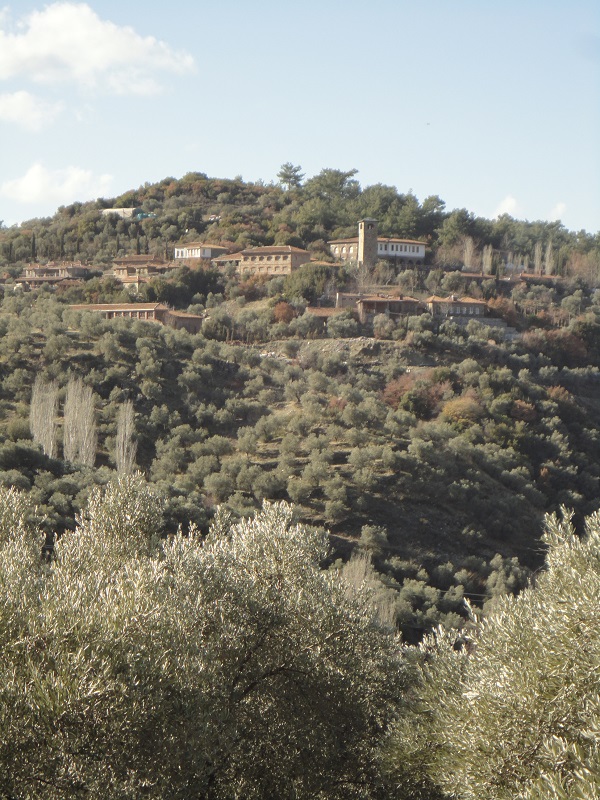
Nesin Mathematics Village from the east
Wednesday, January 18, 2017
The very fact that I am returning to this article tends to answer a question that I raised originally: was the purpose of this article served with the drafting, before it was published? Writing things down can be worth while, even if nobody, including oneself, ever reads what one has written. At the very least, taking notes is a great way to stay awake during a lecture. In a solitary moment, putting pen to paper will clarify one’s thoughts. At least it will bring out the strongest current in the stream of consciousness. Are there weaker currents that are still worthy of notice? If so, this is where rereading what one has written may be worthwhile. One may then be able to see what is missing.
I have been rereading a long article that I submitted to a journal last summer. While at the Village, I received notice that the referee was finally recommending rejection. The referee acknowledged all of the work that had gone into the article. However, they (the referee) did not understand the flow of ideas: it was neither historical nor conceptual, they thought. Nonetheless, a friend had written of my draft, before submission, “this is a brilliant paper. It raises issues not normally discussed – neither by mathematicians nor [by] philosophers / historians of mathematics.”
Readers differ in what they are looking for. The journal editor said a revision of my article could still be publishable, despite the referee’s rejection. Rereading the article, I remembered that indeed I had not worked hard to clarify its flow. I did not mind if the article took me this way and that; but an impatient reader might. I still think the direction of thought is correct; but I am trying now to explain this in words, instead of leaving readers to figure it out for themselves, or give up.
I return to the present meditation on books read at the Math Village. In fact I had already started reading one of these books on the computer screen at home in Istanbul. In the Foreword, I had encountered the following:
When all right-thinking human beings are struggling to remember that other men and women are free to be different, and free to become more different still, how can one honestly write a rulebook?
I agree with the hypothesis of the question: it is right to remember both our differences and our right to be different. The rulebook that brings itself into question by this hypothesis is called The Elements of Typographical Style (version 3.2), by Robert Bringhurst (Point Roberts, WA, and Vancouver, BC: Hartley & Marks, 2008). I do not remember how I found this book electronically. Now I have found a physical copy of the book, on a shelf in the little stone house where I stayed in the Nesin Mathematics Village, above Ephesus.

Why write a rulebook? One writes for freedom. If there are no rules, then there can be no freedom to break them. I used to annoy a teacher or two by insisting on this freedom, without having learned the rules. It took me a long time, for example, to agree to learn the grammatical rules for where to put commas in sentences.
If a passage of Bringhurst’s book delights me, and I want to share it, I cannot just cut it from the electronic version and paste it here. The electronic version is apparently an image alone. It lacks an underlying plain text. This may be by design. Bringhurst’s book is not just a string of letters and words; it is a string of pages, each laid out as a visible whole, according to the author’s principles of style. The cutting and pasting of text would erase the style; and it is with style that the author has transcended the original function of typography. As he observes:
The original purpose of type was simply copying … This excuse for setting texts in type has disappeared. In the age of photolithography, digital scanning and offset printing, it is as easy to print directly from handwritten copy as from text that is typographically composed.
Perhaps I could clip part of the author’s pdf file, convert it to a format like jpg, and include it here as an image. Instead of typing our blogs or emails, we could write them out by hand and post their photographs. This may even be a good idea, if one wants to foil any automated surveillance. Or is optical character recognition now good enough to read the random person’s cursive handwriting? In any case, handwriting would convey more of the person.
Handwriting would convey more of the person. This is one reason why I think mathematics talks should be written out by hand, preferably on a blackboard, as they are being delivered. This is how I delivered my lectures in the Math Village: I spoke aloud, mostly in Turkish, but wrote in English with chalk on the blackboards. Some students came to me later for clarification of their own handwritten copies of what I have written.
Bringhurst was trying to give reason to continue to use typography and to care about it. The subject is odd. Like a person’s cleverness, typography should not call attention to itself. As Fowler suggests in A Dictionary of Modern English Usage, you may pronounce a French word so as to show that it is not English; but if you go too far, you only distract your listener.
Display of superior knowledge [writes Fowler, under “French words”] is as great a vulgarity as display of superior wealth – greater, indeed, inasmuch as knowledge should tend more definitely than wealth towards discretion & good manners …
To say a French word in the middle of an English sentence exactly as it would be said by a Frenchman in a French sentence is a feat demanding an acrobatic mouth; the muscles have to be suddenly adjusted to a performance of a different nature, & after it as suddenly recalled to the normal state: it is a feat that should not be attempted; the greater its success as a tour de force, the greater its failure as a step in the conversational progress; for your collocutor, aware that he could not have done it himself, has his attention distracted whether he admires or is humiliated. All that is necessary is a polite acknowledgement of indebtedness to the French language indicated by some approach in some part of the word to the foreign sound, & even this only when the difference between the foreign & the corresponding natural English sound is too marked to escape a dull ear. For instance, in tête-à-tête no attempt need or should be made to distinguish French ê from English ā, but the calling it tā′tahtā′t instead of the natural English tā′tatā′t rightly stamps it as foreign …
This is also somehow connected in my mind with Bringhurt’s observation:
Letterforms change constantly yet differ very little, because they are alive.
Like the living mouth, the living letterforms do not take well to violent contortions.
When one does engage in typesetting, then one learns to notice it. Having grown accustomed to typesetting my own writing with LaTeX, I have developed opinions that turn out to be at odds with some of Bringhurst’s. Contrary to his recommendation, I think sentences ought to be spaced more widely than are the words within those sentences. Scanning ahead of the current focal point, the eye ought be able to tell that, when William Strunk and E. B. White are going to be mentioned, the “B.” will not mark the end of a sentence. I cannot practically achieve the desired effect in this blog.
I can separate “E. B.” with a thin space ( ), rather than a normal space or none at all. I am still not sure that I should do this; it’s pernickety, and the thin space is not recognized by the old feature phone where I may proofread my articles. However, Bringhurst says,
Names such as W.B. Yeats and J.C.L. Prillwitz need hair spaces, thin spaces, or no spaces at all after the intermediary periods. A normal word space follows the last period in the string.
I would prefer normal word space to no space after the other periods.
Again despite Bringhurst’s recommendation, I think if a word is made bold, then any following punctuation should also be bold, lest it be confused for a flyspeck. Bringhurst doesn’t care whether you put commas and periods inside or outside of quotation marks; but I have decided that they should always be put inside, since otherwise the isolated marks look out of place. Colons and semicolons can be placed outside, since their height will give them a visual connection with the quotation mark. Here it seems I find myself in rather violent disagreement both with Fowler and with the editor of the second edition of Fowler, Sir Ernest Gowers (who turns out to be the great-grandfather of Timothy Gowers, whose work in explaining mathematics I admire). Fowler and Gowers prefer what Gowers calls “logical” punctuation; however, as a logician, I prefer the “conventional.” It is not the job of logic to tell us what to do; logic only explains what we do do, or perhaps what we want to do. I have just explained the logic of my views on punctuation.
Bringhurst takes up some matters of which I should otherwise have had no conception. If you are going to print a book about, say, Italian cuisine, then you ought to use a typeface designed in Italy. If your book is about feminism, you might pick a typeface designed by a woman.
In my own typesetting, I have generally been content with the default Computer Modern typeface of TeX. I have occasionally tried alternatives, but they have not looked so nice. I did recently figure out that I could change the default text size of this very blog, along with the typeface. Almost at random, I picked Baskerville, in a larger size than the default. I was pleased with the result.
When he illustrates the mechanics of sectional headings, I appreciate how Bringhurst has chosen, for a sample text, Thoreau’s “Life Without Principle”:
In proportion as our inward life fails, we go more constantly and desperately to the post office. You may depend on it, that the poor fellow who walks away with the greatest number of letters … has not heard from himself this long while.
For Thoreau, are letters the unreachable sour grapes? In Walden, “Where I Lived, and What I Lived for,” he says,
For my part, I could easily do without the post-office. I think that there are very few important communications made through it. To speak critically, I never received more than one or two letters in my life – I wrote this some years ago – that were worth the postage.
I’m afraid the poor man had never received a billet-doux from a sweetheart. I myself can remember savoring and treasuring an envelope before even opening it.
And yet Thoreau’s remarks may say something about social media today. In the big city, I spend time reading Twitter, to be in touch with the latest news and with those persons who are also following the news. When I am in a little village in the hills above the Aegean, I mostly forget about Twitter: there is so much else worth thinking about, or just looking at. As Thoreau also says in “Life without Principle,”
If a man walk in the woods for love of them half of each day, he is in danger of being regarded as a loafer; but if he spends his whole day as a speculator, shearing off those woods and making earth bald before her time, he is esteemed an industrious and enterprising citizen.
The few remaining woods of Istanbul are constantly being shorn off. (See “Karadeniz,” the page associated with “Eastern Black Sea Yayla Tour,” August, 2018.)

To the Village I brought with me a book that I had read as an adolescent, but then mostly forgotten about: Gödel, Escher, Bach (New York: Vintage Books, 1980). Douglas Hofstadter raises the question of whether there can be a message that reveals itself as a message to any intelligence, even one from another planet. One may speculate about what extraterrestials would make of Baroque music, but Robert Bringhurst brings things nicely down to earth:
Writing systems vary, but a good page is not hard to learn to recognize, whether it comes from Táng Dynasty China, the Egyptian New Kingdom or Renaissance Italy. The principles that unite these distant schools of design are based on the structure and scale of the human body – the eye, the hand and the forearm in particular – and on the invisible but no less real, no less demanding and no less sensuous anatomy of the human mind. I don’t like to call these principles universals, because they are largely unique to our species. Dogs and ants, for example, read and write by more chemical means. But the underlying principles of typography are, at any rate, stable enough to weather any number of human fashions and fads.
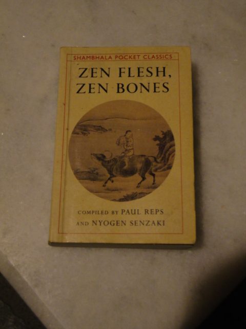
I do credit Douglas Hofstadter with introducing me to Zen Buddhism through his quotations from Zen Flesh, Zen Bones, compiled by Paul Reps and Nyogen Senzaki. At the age of fifteen, I naïvely thought the bookstore of the Virginia Theological Seminary in my home town ought to carry such a book. It didn’t, but the manager ordered the book for me. I gave that paperback to a friend at St John’s College, Santa Fe, when he had to leave for what was apparently schizophrenia. My giving the book away became an excuse to buy the boxed hardback edition in the College bookstore that I had coveted. I have that hardback in Istanbul now; with me in the Math Village was the Shambala Pocket Classics edition (Boston & London, 1994), which I dipped into to see how many of my ideas could be traced to it. Among the “101 Zen Stories,” I like, for example, number 61, “Gudo and the Emperor,” which begins:
The emperor Goyozei was studying Zen under Gudo. He inquired: “In Zen this very mind is Buddha. Is this correct?”
Gudo answered: “If I say yes, you will think that you understand without understanding. If I say no, I would be contradicting a fact which many understand quite well.”
Collingwood argues that truth is found not in statements alone, but in their combination with the questions that they answer. Gudo develops the thought further. Even what is grammatically a question may not be so in reality. The emperor’s question about the mind as Buddha is not a real question, because an answer could serve him only as something to be regurgitated on examination by his tutor.
Ekai, called Mumon, writes in the introduction to the collection of his kōan:
In the year 1228 I was lecturing monks in the Ryusho temple in eastern China, and at their request I retold old koans, endeavoring to inspire their Zen spirit. I meant to use the koans as a man who picks up a piece of brick to knock at a gate, and after the gate is opened the brick is useless and is thrown away. My notes, however, were collected unexpectedly, and there were forty-eight koans, together with my comment in prose and verse concerning each, although their arrangement was not in the order of the telling. I have called the book The Gateless Gate, wishing students to read it as a guide.
Senzaki and Reps may have been free with their translation. I found a website with the original Chinese and what is presumably a more literal translation:
In the summer of the first year of Jotei, Ekai was in Ryusho Temple and as head monk worked with the monks, using the cases of the ancient masters as brickbats to batter the gate and lead them on according to their respective capacities. The text was written down not according to any scheme, but just to make a collection of forty-eight cases. It is called Mumonkan, “The Gateless Gate.”
Senzaki and Reps seem to have added the idea that the brickbat will be discarded once it has served its purpose. The idea may well be implicit in the original text. The need to expand the text for a Western audience is shown in the story whose title is given the literal translation, “Inch Time Foot Gem”:
A lord asked Takuan, a Zen Teacher, to suggest how he might pass the time. He felt his days very long attending his office and sitting stiffly to receive the homage of others.
Takuan wrote eight Chinese characters and gave them to the man:
Not twice this day
Inch time foot gem.This day will not come again.
Each minute is worth a priceless gem.
It was probably some time before I understood that the first two verses were the literal translation, character by character (except that the Chinese may not have used our inches and feet); the other two verses were just a freer translation.
I wondered whether writings such as this blog had already served their purpose, once they were drafted. However, in the present case, it was looking at an early forgotten blog article of mine, Science and anti-science, that led me back to Gödel, Escher, Bach.
Edited September 3, 2025, because GEB came up in “Omniscience” as being where I had learned a French translation of “Jabberwocky”; and again on April 13, 2026

3 Trackbacks
[…] (Toronto: Anansi, 2006). There’s a foreward by Douglas R. Hofstadter, whom I discussed in “Writing, Typography, and Nature.” In Roberts’s book, Hofstadter recalls discovering, in adolescence, Kelley’s General […]
[…] which I read in high school. Hofstadter has come up a few times on this blog, as for example in “Writing, Typography, and Nature,” to name the post that might be best connected to this one. In sixth grade, “Jabberwocky” […]
[…] September 3, 2025, because of the mention added to “Writing, Typography, and Nature” on the same […]